Every company tells its story differently—and your annual report should reflect exactly that. At AnnualReports.ai, we believe great design is more than just aesthetics. It’s about aligning your report with your brand, your strategy, and the message you want to communicate to investors.
Whether you’re a fast-growing tech company, an established financial institution, or a purpose-driven organisation, the design of your annual report plays a critical role in how your performance is perceived. That’s why we offer a wide range of professional design themes, each tailored to different industries, audiences, and communication goals.
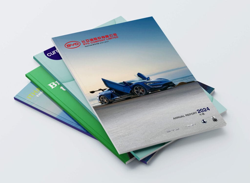
Below are some of the most common design approaches we create for our clients:
Minimalist & professional
Clean layouts, refined typography, and a focus on clarity define this approach. Ideal for companies that want to present information in a straightforward, no-distractions format, this style ensures that financials and key messages are front and centre. It’s particularly effective for organisations that value precision and credibility.
Corporate & institutional
This is a more traditional approach, often used by financial institutions and large corporates. It emphasises structure, consistency, and authority, with a formal tone that builds trust with stakeholders. Think strong grids, conservative colour palettes, and clearly segmented sections.
Futuristic & tech-focused
Perfect for innovation-driven companies, this theme uses modern visuals, dynamic layouts, and forward-looking design elements. It signals growth, disruption, and technological leadership—helping position your company at the cutting edge of your industry.
Editorial & story-driven
For companies that want to go beyond numbers, this approach focuses on narrative. Inspired by magazine layouts, it combines strong visuals, feature sections, and storytelling techniques to guide readers through the company’s journey over the past year. It’s ideal for brands that want to build a deeper emotional connection with their audience.
Data-driven & infographic-led
When your report is rich in data, clarity is everything. This theme transforms complex information into intuitive charts, graphs, and infographics that are easy to understand at a glance. It’s particularly effective for highlighting performance metrics, trends, and strategic progress.
Sustainability & ESG-focused
Sustainability & ESG-focused for companies with a strong environmental and social mission, this design theme brings ESG commitments to life. It often incorporates natural colour palettes, impactful imagery, and dedicated sections for sustainability reporting—helping communicate purpose alongside performance.
Bold & brand-driven
This approach puts your brand front and centre. Using distinctive colours, typography, and visual elements, it creates a report that feels unmistakably “you.” It’s ideal for companies with a strong brand identity that want consistency across all communications.
People & culture focused
Behind every set of results is a team. This theme highlights employees, leadership, and company culture through photography, interviews, and human-centric storytelling. It’s particularly powerful for organisations that see people as a key driver of success.
Ultimately, the right design isn’t just about looking good—it’s about communicating the right message to the right audience. A well-designed annual report reinforces your brand, builds investor confidence, and ensures your story is understood.
At AnnualReports.ai, we combine design expertise with AI-powered efficiency to deliver reports that are not only visually compelling, but strategically aligned with your business.